What is a Responsive Web Design / Part 2

Accessing the Internet via a phone has now surpassed any other method. On average, US adults spend 34 hours per month accessing the Internet via their phone compared to 27 hours a month through a PC.
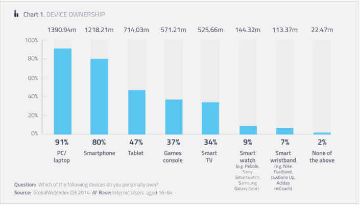
80% of online adults own a smartphone in the US.

As the method of accessing the Internet shifts to mobile devices like smartphones, tablets and other devices, it becomes evident that websites need to rise to that technological challenge. Although there are a few different ways to accomplish that responsive web design is one of them.
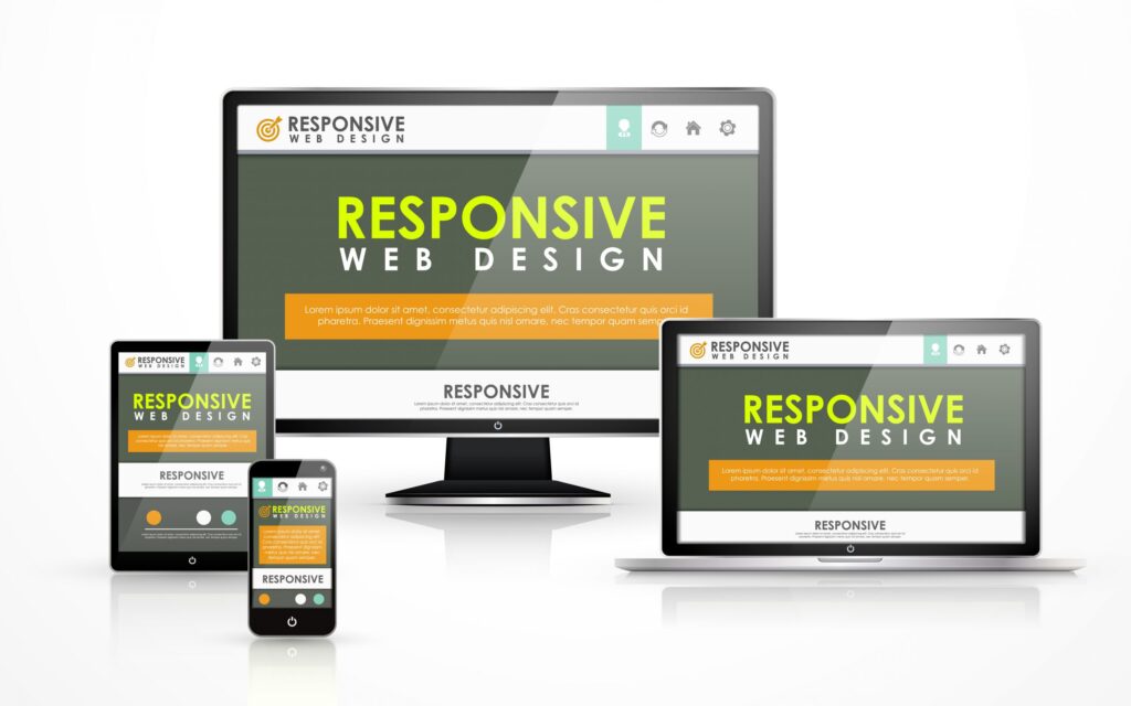
The responsive design approach was adopted in web design so the website with all its components will resize (or “respond”) itself for the device it’s being viewed on. This improves the user experience by eliminating the need for the user to try and resize the site manually. Responsive design is a web development process that creates the best user experience no matter what device is being used to access the website.
The method used to resize the website is done behind the scenes with CSS files (Cascading Style Sheets). It’s the code that formats the layout of a web page. CSS is used to allow a website to scale to the width needed for optimal use. Javascript and jQuery are also typically used to facilitate this behavior so the options are more dynamic. It’s important to take the user input that would normally come from a mouse and change it to a touch screen input.
The other web formats like the adaptive design and m-dot sites, the responsive design does not detect which device you are on. Instead, it uses CSS media queries to determine screen width and orientation as well as the browser you are using.
Three components of a responsive design: Breakpoints, Design and Fluid Sailing
Breakpoints
When CSS3 media queries a device for boundary widths, this triggers the alternate styles. eCreations sets the breakpoints for various device sizes & orientations based on the type of device you’re likely using. Most smartphones fall within a certain size as do tablets and desktops. Those sizes are programmed into the CSS. If you use a computer to resize your screen, you will notice that the website has a few points where it shifts the layout of the site. Also, the browser you are using has those alignment points as well so the coding of the responsive design taps into that information too. There are a few exceptions to these rules, this is where the next component comes into play.
Fluidity
Fluid scaling involves percentage values that allow the screen to adjust to the boundaries that are set as well as the browser. Fluid scaling is used to maintain responsiveness between the breakpoints. It also maximizes the available space and keeps the columns aligned in the grid.
Design
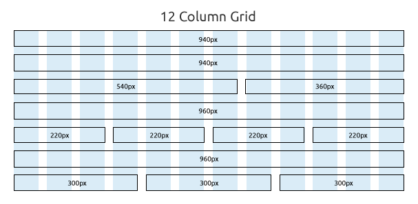
Grids are also used at times to provide structure for the site. This includes the sidebars and body. The grid is where the device widths and breakpoints are loaded so the layout of the site has a pre-established place for each component to land when the breakpoint is hit. Normally a 960-pixel grid system is used which has 12 columns. You can see the grid system below.

While eCreations works on the design of a website, we emphasize the retention of the elements as the spacing and sizing flow from desktop to mobile. This allows for fluid scaling without loading unnecessary or duplicate elements.
Responsive Design by eCreations LLC
Our highly qualified software engineers, graphic designers, and web developers work together to make sure that every page on your site flows seamlessly through every possible display type and provides the best user experience for your visitors. Quality checks are performed for all browsers and all platforms to make sure the break points and fluidity are working properly.
Our goal is to provide an optimal user experience for your website visitors so that they can become your customers. We’re not the only ones concerned with the user experience; Google is so concerned about it that they have made it a big component in the algorithm that determines if your website will show up in a search.
Brad Haws / eCreations LLC
7-22-15

